Showing posts with label Geography. Show all posts

Thursday, November 26, 2009

GIS Wikipedia is alive

As ESRI user I am used to visit support center in search for software requirements, technical articles or description of workaround and known bugs. Now ESRI has created a new Wiki site  http://wiki.gis.com/

Even if it is initiated by ESRI Wiki.GIS is not about ESRI, it is about GIS and us, users being successful in what we do day to day.


Wiki.GIS.com is a community-generated, GIS-centric encyclopedia that serves as a repository for factual, unbiased GIS content. Wiki.GIS.com will seek to involve the GIS community in an ongoing process of creation and collaboration of conceptual GIS information. Wiki.GIS.com will use the passion and knowledge each one of you has, in order to offer another resource for users to help others. All content ownership will be shared by the GIS community


There is already reasonable amount of content there including list of all ESRI software, 32 free software packages and Google Earth section with 5 pages.


As described below it is up to us to make this work.

The success of wiki.GIS.com depends on the contributions of GIS professionals, students, and the GIS community-at-large. We invite all the people who have a common interest in sharing GIS knowledge and ideas to create a login account on wiki.GIS.com and then begin editing existing pages or adding their own GIS-related content to the wiki. We have a list of requested pages on the wiki for which we are seeking content, but please feel free to add more topics/content as you deem fit. All unbiased GIS-related content is welcome.


Friday, September 25, 2009

New topographic map series for New Zealand

Yesterday LINZ has released a new map series of topographic maps for 1:50,000. It is also known as Topo50. Significance of this release is in fact that it is based on New Zealand Transverse Mercator projection and NZGD2000 – new datum for New Zealand.

Details, samples and other information is available on new web site Topo50 Map.

Topo50
Main reason for change of map series is summarized in FAQ section:
The change was required as a result of Land Information New Zealand releasing a new national datum New Zealand Geodetic Datum 2000 (NZGD2000) to replace the New Zealand Geodetic Datum 1949 (NZGD1949).

The NZGD1949 datum was a ‘local’ datum that was no longer accurate enough and was limited by the survey technology available at the time. The accuracy has also degraded significantly due to the natural process of earth deformation.

The NZGD2000 datum is an ‘international’ datum and for all practical purposes is the same as that use by GPS.
As a result of this datum change coordinates on map series have moved by 190m in north/sourh and 10m east/west direction.

On Downloads page there is a PDF with fact sheet (only 114 KB) with details of NZTM2000 (New Zealand Transverse Mercator 2000) and how to use new maps with GPS.

Projection
Transverse Mercator
Origin Latitude
0.0 degrees South
Origin Longitude
173.0 degrees East
False Northing
10,000,00 m North
False Easting
1,600,000 m East
Central Meridian scale factor
0.9996


If you are outside of New Zealand and you are using NZ maps make sure you get new ones.

Wednesday, August 19, 2009

ArcGIS Explorer 900, Part 2

Since my first post I was quite busy so this post is coming later then I wanted. In the meantime ESRI was busy writing about it on ArcGIS Explorer blog.
There are four new posts about release 900 after it was released. The posts are:
There is one something I have noticed but I haven’t heard from other users. When I start AGX my Vista is changing colour scheme to Basic. This usually happens when application does not have enough resources. In addition to that when starting AGX  from home (using wireless network) for a short time I internet connection is gone. My guess is again maxing out resources of PC. By the way that is HP laptop with Core 2 Duo 2.3 GHz and 2 GB RAM.
Unfortunately, I still don’t have time to explore new options. The ones I am really interested are package layers, projections, presentation mode and customization. When I get more information I summarize them here.

Tuesday, July 14, 2009

ESRI UC 2009 Day 1 update

Here are most interesting bits from day 1 of the ESRI User Conference. Unfortunately these are not first hand news but compiled from number of blogs and news from the internet.

Plenary session
In first part Jack has described the vision of this conference – Maps and GIS are changing and there are new ways to take advantage of GIS.

ArcGIS Explorer 900 was showed and new features were demonstrated (more on that later).
Second part was about the next release – 9.4. Highlights of upcoming 9.4 version are:
  • Run in parallel with 9.3 on same machine
  • New dockable windows (attribute table, ArcCatalog, etc)
  • Search integrated in ArcMap
  • Search for symbol by name
  • Predefined edit tasks
  • Integration of Python in ArcMap
  • New Base maps for continuous redraw and panning
  • Improved 3D performance and SketchUp support
  • Open geodatabase API
ArcGIS Explorer 900
Information about AGX 900 is know for a while but now the key features were shown and more details can be found on AGX blog. These include:
  • Toggle between 3D and 2D
  • Use of layer packages from ArcGIS 9.3.1
  • Presentation mode
  • Ribbon interface
  • Bing data support
  • Support for all ArcGIS projections and transformations
  • Customization without programming
Other news
  • ArcGIS API for Silverlight/WPF released
  • ArcGIS API for Silverlight/WPF toolkit released on Codeplex
  • MapIt product released
This is just a very quick pick of most interesting topics. More details coming soon.

Monday, July 13, 2009

ESRI 2009 User Conference starts tomorrow

Tomorrow is the start of User Conference for 2009. As expected there is an official page providing lot of information like featured sessions, on-line agenda, accommodation and other.

image

Collection of quick links include Facebook, Twitter and Flickr pages. As alternative you can simply subscribe to RSS feeds from this page.

If you haven’t been at the Conference you know it is really busy and spread across very large area. To help you find your way use UC Route Finder. This will show distance and time required to get to the destination and it is also viewable in 3D.

image

Very soon we are expecting a flood of news from the Conference. I am hoping that ArcGIS Explorer 900 will be released within next few days. AGX blog has plenty of information and photos from specialist events where it will be demonstrated (homeland security, education, etc).

It will be quite hard to keep up with all news but hopefully in next week or two I’ll be able to pick out most interesting news and videos.

Wednesday, July 1, 2009

Q & A about 2009 ESRI International User Conference

2009 ESRI User Conference is near (13-17 July) and ESRI has published the results from survey. Make sure you have plenty of free time if you want to read the full Q & A document – there are 178 questions and answers!

image

Full list is available here. I will post my pick of most interesting questions from this list later this week.

Thursday, June 25, 2009

Creating effective web maps seminar

Eagle Technology is hosting a complimentary seminar about creation and deployment of modern web maps maps and make the most of your investment in GIS data and infrastructure.

clip_image001

Some spaces are still available in Wellington and Auckland.

Location: Auckland, Eagle Technology office
Date: Tuesday June 30, 2009

Location: Wellington, Eagle Technology office
Date: Thursday July 2, 2009

The same seminar will be held in the morning and repeated in the afternoon.
Please advise which session you would like to attend as places are limited.

AGENDA:

Morning session:
9:00-10:15: Design Strategies for Authoring and Publishing
10:15-10:30: break
10:30-12:00: Building Web Applications

Afternoon session:
1:00-2:15: Design Strategies for Authoring and Publishing
2:15-2:30: break
2:30-4:00: Building Web Applications

To register visit - www.eagle.co.nz/gis931

ColorBrewer 2.0 released

Well known ColorBrewer just got a facelift with release of ColorBrewer 2. Just in case you have not used the essence is compacted in a single line.
Color advice for cartography
Driven by this simple idea Cynthia Brewer created this very useful web application. The new version is Flash based but the functionality is the same as in old one.
What I like about ColorBrewer is that evey option, like “pick a color scheme:” has a learn more > link.
image
Under this link there are descriptions of icons or references to related books or web sites.
image
image
The process of selecting data classes, colours is easy and provides quick feedback using a sample map. In addition to this there is a  new option to downlad ColorTool for use in ArcGIS directly. If you are not ArcGIS user these colours can be exported to Excel file, Adobe Swatch Exchange or just set of color values (RGB, CMYK or HEX).
image
This a very useful site and I recommend it to anyone working in GIS or cartographic design.

Thursday, March 12, 2009

ESRI TV updates

YouTube ESRI TV channel recently added five new videos added. The new videos are:
  • ESRI FedUC 2009 Imagery Presentation - Part 1
  • ESRI FedUC 2009 Imagery Presentation - Part 2
  • ESRI Careers in Product Development: 3D Team
  • ESRI Careers in Product Development: ArcGIS Mobile Team
  • ESRI Careers in Product Development
While there check other videos. There is a number of videos showing new features in ArcGIS 9.3, mashups, ArcGIS Explorer and other videos.

Wednesday, February 4, 2009

Google Earth 5 beta release includes oceans, history and Mars

Two days ago Google has released beta version of it's very popular application Google Earth. This version is a beta so we should expect some minor changes in final release.

Right after start you can notice some changes. New features are briefly described in start up tips.
Key new features are:
  • Oceans
  • Historic images
  • Mars
  • Tours
Here are startup tips about new features.


This is a nice feature and one that was expected to be part of Google Earth sooner or later. After all water covers about 71% of Earth's surface. Mapping of seabed is valuable teaching tool and it provides an insight into greater picture of our planet.
Rendering of water surface is quite nice and animated. Screenshot below can't really show nice surface and moving water but you get the idea.
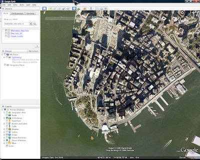
History view is a nice feature where availble. For example Manhattan has earlest imagery from 1974 right up to 2009. See examples below and have a lool at the top of the map area for time slider.
Some other places (like my home town of Osijek, Croatia) has imagery from 2006 onwards only. Hopefuly this will improve over time like other Google Earth coverage.
 Tours can be created with full control over speed, wait at features, camera tilt and other settings. Given enough time we should see plenty of tours.
 These features are also described in help (accessible on-line) over here. Google Earth can be downloaded from Google Earth main page.


Coverage and review of Google Mars is coming soon.

Tuesday, January 27, 2009

New features in upcoming ArcGIS 9.3.1

ESRI is working on new version of ArcGIS, 9.3.1 and it should be available in second quarter of this year. At the moments there are some new features announced but I'm sure there will be a lot more.

So far here are new features:

High performance dynamic map publishing
This will allow faster map drawing that outperforms equivalent ArcIMS service and shorten map caching time. New "Map service publishing" toolbar can be used to review MXD for errors, unsupported content, provide estimate of rendering time and save in new format.


New layer sharing options
Layer files will be packed with data (optional) so they can be e-mailed, shared or used with ArcGIS Online.


Enhanced support for Java
Java developers will be able to extend ArcObjects framework and create native custom geoprocessing tools, server object extensions, class extensions, custom renderers, etc. Also, support for integration with Eclipse IDE is added.


Easy to migrate
Finally, upgrading does not require uninstall of ArcGIS 9.3. In addition to this there are no changes to geodatabase and map document formats.

Full info is available here.

Wednesday, December 17, 2008

Interview with Jack Dangermond

At Enterprise Applications web site there is an inverview with Jack Dangermond, founder of ESRI. This is one of rare interviews (relatively short one) and Jack talks about various topics, from philosophy of ESRI as a company to open source.

Quote about Microsoft and Google:

Microsoft and Google, and Yahoo to a large extent, are very much consumer-focused. They look at mapping and geospatial visualisation as one more aspect of search. It’s all about spatial search as an augmentation to traditional web search. This is a very exiting field; it concentrates on a global base map for visualisation and association.


They both become active in being able to support embeddable mapping for locator services and they are both spending between $100m - $150m, a year on developing content for that base map. The technology itself is highly optimised for fast visualisation access; it’s not a GIS system.

Tuesday, December 16, 2008

ESRI TV updates

ESRI TV channel on YouTube has a number of new videos added. They are all for current release, 9.3. Videos cover a range of topics from analysis, mapping and data management up to ArcGIS Explorer.

Here is a complete list of newly added videos.

  • ArcGIS 9.3: Advanced planning and analysis - Part 2
  • ArcGIS 9.3: Easier dissemination of spatial information using ArcGIS Explorer - Part 2
  • ArcGIS 9.3: Easier dissemination of spatial information using ArcGIS Explorer - Part 1
  • ArcGIS 9.3: Advanced planning and analysis - Part 1
  • ArcGIS 9.3: Productivity enhancements at 9.3 - Part 2
  • ArcGIS 9.3: Productivity enhancements at 9.3 - Part 1ArcGIS 9.3: Create Web mapping applications using Web APIs
  • ArcGIS 9.3: Create Web mapping applications using ArcGIS Server Manager
  • ArcGIS 9.3: Improve mobility using ArcGIS Mobile
  • ArcGIS 9.3: See an example of how an Insurance Claims Manager uses ArcGIS and a mobile solution
  • ArcGIS 9.3 Data Mgmt Part 4: Data Replication
  • ArcGIS 9.3 Data Mgmt Part 3: Experienced desktop user employing ArcEditor in a PWDPWD
  • ArcGIS 9.3 Data Mgmt Part 2: Experienced desktop user employing ArcEditor in a Planning Department
  • ArcGIS 9.3 Data Mgmt Part 1: Create, update, and manage asset information using ArcGIS Desktop
  • ArcGIS 9.3: Cartographic enhancements at 9.3
  • ArcGIS 9.3: Creating high-quality maps using ArcInfo
  • ArcGIS 9.3: Disseminate Information Throughout The Web Using ArcGIS Server
  • ArcGIS 9.3: Disseminate Information To The Field Using ArcGIS Mobile
  • ArcGIS 9.3: The Complete GIS for the Enterprise
  • Reporting Tools with ArcGIS Business Analyst
Videos vary in length from 3 to 10 minutes and are good way to see what is new. Of course this will show you just a tip of an iceberg...

Friday, December 12, 2008

Making globes

Since I was a kid I wondered how do they make globes. If you want to find out here is a 5 minutes long video that shows you the whole process.


Enjoy!

Tuesday, November 25, 2008

ArcGIS 9.3 SP 1 released and other updates

ESRI has released Service Pack 1 for ArcGIS 9.3 earlier this month. Service pack is available for download from ESRI’s support site download section. The service pack was announced earlier (see posts ArcGIS 9.3 SP1 fixes, Part 1 and ArcGIS 9.3 SP1 fixes, Part 2)  and more fixes are added to the list.


Even if you are not too interested in bug fixes you should consider downloading and installing it because it also introduces new functionality. New features are listed separately in a PDF document. The feature list includes:

  • Export to CAD is now ArcView license tool
  • Support for WFS 1.0 (1.1 is already supported at 9.3)
  • Improved visibility of scale bar for web applications
  • Support for Windows Mobile Smartphone’s
  • Full support for editing data in PostGres SQL
  • Progress indicator for map and globe caching


Scale bar visibility improvements


Unfortunately, there was a one part of code that was not included in SP 1. That is Topology validation patch and it is available as separate download.


ESRI has released Service Pack 1 for all other 9.3 products. So now SP1 is available for:


I would recommend you download these and check the new features list.

Thursday, October 9, 2008

Geocommons Maker! review

Last week Geocommons has released a Maker!, a tool that 

allows you to create professional-looking interactive maps from a wide variety of geographic data in only a few minutes.

Maker! is designed to provide you with data, tools and guides to create on-line maps very quickly. As always one would not check the tutorials and dive straight into the making of the maps. This is what I did the first time.


Making maps


 Maker

"Make a map" button is very hard to miss and after clicking you are presented with usual sign in dialog. But there is a pleasant surprise.  After choosing login and password (assuming you are creating a new account) you don't have to wait to get an email, validate and then start using the Maker! Just agree to conditions and start making maps.


Maker SignIn


How to make a map in Maker? I'll try to make a map of Croatia. This is the main window once you are signed in.


MakerMain


Most of the buttons have a tips - just place mouse over a button and description will tell you what is it used for. Description will show up after 2 seconds, a little bit too long for my liking. Also, button next to map title does not have a tip.

MapTitle

To give your map a name click on the button (highlighted in picture above), type and click on it again. Original plan was to make a population map of Croatia but there isn't much data at this point. So instead of population I'll use wine regions of the world. Data loading can take some time to load, up to 20 seconds. If it does not get loaded you are asked to retry or cancel adding the data.  After adding this data (from Google Earth) maps looks like this.

wineCroatia

Default base map is a Google terrain with boundaries, main places and hydrological features.

CroatiaWine

Next I want to customize this map. Unfortunately, data I selected does not give me many options so I'll use something else for review. Since most of the available data is for US I'll use that. Let's look at the Certified Organic Pasture and Cropland in USA in 2005.

To help and guide you with map making process Maker! is using a Map Brewer. Does that sound familiar? ColorBrewer, TypeBrewer are already there and well known and now there is a Map Brewer...


MapBrewer1

First step of Map Brewer is about the selection of qualitative or quantitative symbology and any subset of the data. In this case I'll use areas of organic crops.

In step two you choose colour on size for representing your data.

  MapBrewer2

Now comes the hard part - 3rd step of the process. Classification. This is where I see a problem. User is offered four classification methods: quantile, equal interval, standard deviation and maximum breaks. But, there is no explanation how this classification works or when it should be used. Clicking on "Learn more" does provide more details but not enough.

MapBrewer3

So why is this bad? Because if you use exactly the same data with different classification methods you will produce very different maps. There is a very good book on this subject by Mark Monmonier "How to lie with maps". I would recommend reading this book if you are interested in making maps or reading/evaluating maps.

Step number four is simple one - choosing colours for your data. There are few simple colour schemas offered and they may be OK for most uses.

MapBrewer4

Once layer is finally added to a map is shows in Layers floating window. It has toggle controls for showing Styles window, layer visibility and removal of the layer.

 LayersSmall

It can be unfolded and then it reveals histogram of the data, options for classification, number of classes and data standardization. Some observations in regards to number of classes/categories. There is no description what would be a recommended number of classes or how it can be calculated (e. g. Sturges formula). Also it allows you to select too small number of classes - just two. On the good side it does not offer more than 7 classes. This is very important when using colour shades.

LayersBig

Histogram is interactive and as soon as you change any break values classification is changed to Manual.


Some issues

If you are making more complex maps with more layers then be aware of another issue - transparency. Having multiple layers with transparency will greatly affect colours on your map but you have full control over it and it is up to map maker to control it and decide if it is appropriate for a map.

Closer look at this map opens another topic for discussion. When you are mapping areas of organic farms one should use an equal area projection. But default projection in not an equal area projection. And there is no way to change the projection. I could not find any information about current projection.

If you are new to map making and not too sure how to make a map in Maker there is a tutorial video at "Learn how to use Maker" link. This video is definitely not the best learning tool for several reasons. Firstly, there is too much of panning. Video shows only portion of the screen/maker's window and whenever mouse is moved close to a corner that is not in the current view video is panned. That happens a lot in this video. Secondly, you are guided quite quickly through the process without too much explanation why or how to use Brewer. Demonstrator is quite efficient in using it, as a matter of fact, too efficient for tutorial video. Quite a few steps and options are not described and ones described are done very quickly. Video should be re-done or even split in 2 or 3 videos with in depth descriptions of available tools and options.

Help system is in place but I would like to see a lot more details or links to other documents/sites.


Final words

Maker! is a nice tool for making maps on-line with slick interface, it is simple to use and has options to share your maps.

Combined with Finder! and it's options to upload your own data as CSV, shapefile or KML makes it very powerful tool and no question it will be very popular.

There are few area for improvement but it is a good start. Help system is the one I would like to see worked on first.


Like with any other technology not everybody is good with tools so we can expect to see a large number of bad and useless maps but over the time real gems will stand out. So, keep making maps in Maker! and share your experiences.

Tuesday, September 16, 2008

Cartography Design Annual book available

Nick Springer has compiled a series of maps published during 2007. This is presented by CartoTalk.com Here is a description of this book as published on Lulu:

This unique collection of maps clearly illustrates that the art of map making has not been lost. This is the first edition, showing maps published or released during 2007, in what we hope is a continuing series showcasing some of the top cartographic talent in the world. 

The book contains 78 pages in full colour in paperback. I just hope it will showcase maps similar to the one shown below.

image


If possible I will buy this book and post my review of it here.

Another example of maps collection is from ESRI - Map book series. These are published every year at the time of International ESRI User Conference. The latest one is Volume 23. In these books ESRI is publishing user created maps (of course using ESRI products).


MapBookVol23cover_lrg


I always look forward to reading these book because they are great inspiration and insight for cartography work I may be involved in.

Tuesday, September 9, 2008

GeoCart 2008 impressions

GeoCart 2008 has finished this week. It was second GeoCart I have attended. Even is smaller numbers than the last one it was a very good conference.

Organization

Firstly, the organization was very, very good. This is thank to great effort of Igor Drecki and other individuals that made great effort ensuring everything works flawlessly. I have not seen that anything went wrong or was out of schedule.

Programme

Programme was very interesting. Every day there were two parallel streams. The streams were:

  • Visual exploration
  • Spatial data and knowledge sharing
  • 3D visualisation
  • Spatial modeling and data mining
  • Social, human and egocentric studies
  • Spatial analysis

Authors, co-authors and presenters came from quite a few countries. The map below shows what these countries are (after all this was cartographic conference).
Presentation were interested and very well presented (in most cases). I have noticed something that kind of surprises me. There are highly educated experts and academics that are having hard time delivering the message to the audience. In some cases the visual presentation (slides) are making this even worse. On the other hand I've seen really crafted slides and exceptionally presented papers. Top three presentations (I didn't see all of them) were:

  • (Re)considering Geographical Information Communication in the Era of Web 2.0 by Professor William Carthwright
  • Comparing the Performance and Attitudes of Undergraduates and Adult Professionals in an Online Course in GIS&T by David DiBiase
  • Cloud-based Geospatial Data Processing by Robert Coup

Map exhibition

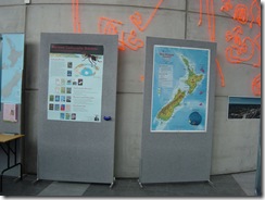
This time there were fewer maps and posters in the exhibition area but they were quite interesting. Exhibited posters were:

  • Adding Value to the National Geospatial Data Holdings: Bundles of data and manifestations of maps
  • Land Use Change for Cambridge and Surrounds, New Zealand: 1991-2006 – a raster comparison using the Map Comparison Kit
  • Mapping the Future: An integrated, multi-scale, spatial decision support system to support long-term community planning
  • Coordinated Visualization of Human Daily Activity Patterns with Ringmaps

For the end here are some photos from the conference.

DSC04375

DSC04376

DSC04377

The wall is curved!

DSC04379

DSC04380

DSC04382

DSC04383

DSC04384

DSC04386

DSC04388

DSC04395

Professors rocking hard

Friday, August 22, 2008

ArcGIS Explorer build 500 released

New release of ArcGIS Explorer is available for download from AGX resource site. This release includes support for subscription based services and new features and enhancements.

Complete list of new features in releases 480 and 500 is available here or you can read my earlier post.

While your Explorer is downloading have a look at the ArcGIS Explorer blog to see what custom task you could add or what other people are using AGX for.

Next release will be the major one with lots of new features. Most prominent one will be change of the user interface. New UI will be MS Office 2007 ribbon like.

ribbon-1

GeoCart 2008, only 10 days away

Fourth GeoCart will take place in Auckland at The University of Auckland from 1- 3 September. Here is where to go if you are not from Auckland.

Map image


The Conference is endorsed by the International Cartographic Association (ICA) and this year it will run in conjunction with SIRC 2008, 20th Annual Colloquium of the Spatial Information Research Centre.


The programme is diverse and presenters are coming from New Zealand, Australia, Slovenia, Croatia, Switzerland and other countries. Papers are equally diverse as the presenters. Papers presented will vary in subjects from remote sensing, spatial analysis to visual exploration.

On Tuesday New Zealand Cartographic Society will have Annual Group Meeting.


I will spend most of my time at the Exhibition area (we have site 4) but I'll try to get to as many paper presentations as I can. This will be another opportunity to meet the cartographers and GIS specialists from New Zealand and world. I look forward to being there.