Starting from next Monday, 27th August following ten days will be a peak of activity for cartography in New Zealand. In just ten days three events will take place - Map Design with ArcGIS Workshop, GeoCart conference and Mountain Cartography Workshop.
First event is Map Design workshop where Dr Kenneth Field and Dr Aileen Buckley will show attendees number of cartographic techniques in ArcGIS and how to create maps for web. This workshop continues the series from last one led by Cynthia Brewer. Workshop will be an excellent opportunity to learn and discuss cartographic tips and tricks from esri's top echelon of cartography.
This will be my fourth GeoCart conference and I am really looking forward to be there. Each conference offers great number of paper presentations, great map display and competition and most importantly opportunity for networking. As usual there will be a number of great speakers including Aileen Buckley, David Fairbairn, Tom Patterson, Roger Smith and Georg Gartner, President of the ICA.
If you want to combine cartography and potential to view volcanic eruption first hand then take a trip into "danger zone" at Mount Tongariro where 8th Mountain Cartography Workshop will take place.
I'll try to keep posting (and maybe tweet) about these events over next couple of weeks. In worst case scenario I'll post an overview when all is done.
Hope to see you there.

Showing posts with label Cartography. Show all posts
Showing posts with label Cartography. Show all posts
Friday, August 24, 2012
Friday, September 10, 2010
Politician that can draw a map
At last GeoCart I caught up with friends and among other things he asked me if I have seen a video clip of US senator drawing a map of US by hand.
By any means drawing a map by hand and from memory is great achievement (and especially for politicians) and should be admired. He can draw a map of US under two minutes! US senator Al Franken has been doing this for years and maps he makes at public events are often auctioned. So have a look how he does that.
By any means drawing a map by hand and from memory is great achievement (and especially for politicians) and should be admired. He can draw a map of US under two minutes! US senator Al Franken has been doing this for years and maps he makes at public events are often auctioned. So have a look how he does that.
Tuesday, September 7, 2010
GeoCart 2010 impressions
GeoCart 2010 is over. This is third GeoCart I've been at and it proves to be a very good conference. More about that later.
Before the conference on 30-31 August I have attended Map Design with ArcGIS workshop led by Dr Cynthia Brewer. It was very well attended (actually quite big one - 45 attendants) and over two days various aspects were covered. Being a very large workshop Igor asked me if I could assist and help out students when needed. Of course, I was more than happy to help. Technically, there wasn't any unknowns for me but Cynthia's and Chris's experiences and advices were very helpful. Most interesting parts were relief shading exercises and generalization. For sure I'll be going back to notes and "playing" more with generalization.
On Wednesday, GeoCart started. I have no intention to write about each keynote or paper presentation. For full details of programme check this link. As usual (for last 3 GeoCart conferences that I can speak for) keynote presenters and presented topics were very well picked. If you have William Cartwright, Cynthia Brewer, Manfred Buchroithner, Phil Allen, Colin MacDonald and David Crossman as keynote speakers it can't fail.
Paper presentations were divided in two streams: applied cartography and academic papers. This was a nice balance and change from previous conference. I prefer to see more applications and products then just cartographic theory and research. In some cases paper presentation quality was below par. I would like to see more skilled presenters delivering these papers. Unfortunately, this is up to author(s) to decide - present it yourself of let the more skilled presenter/colleague to deliver it.
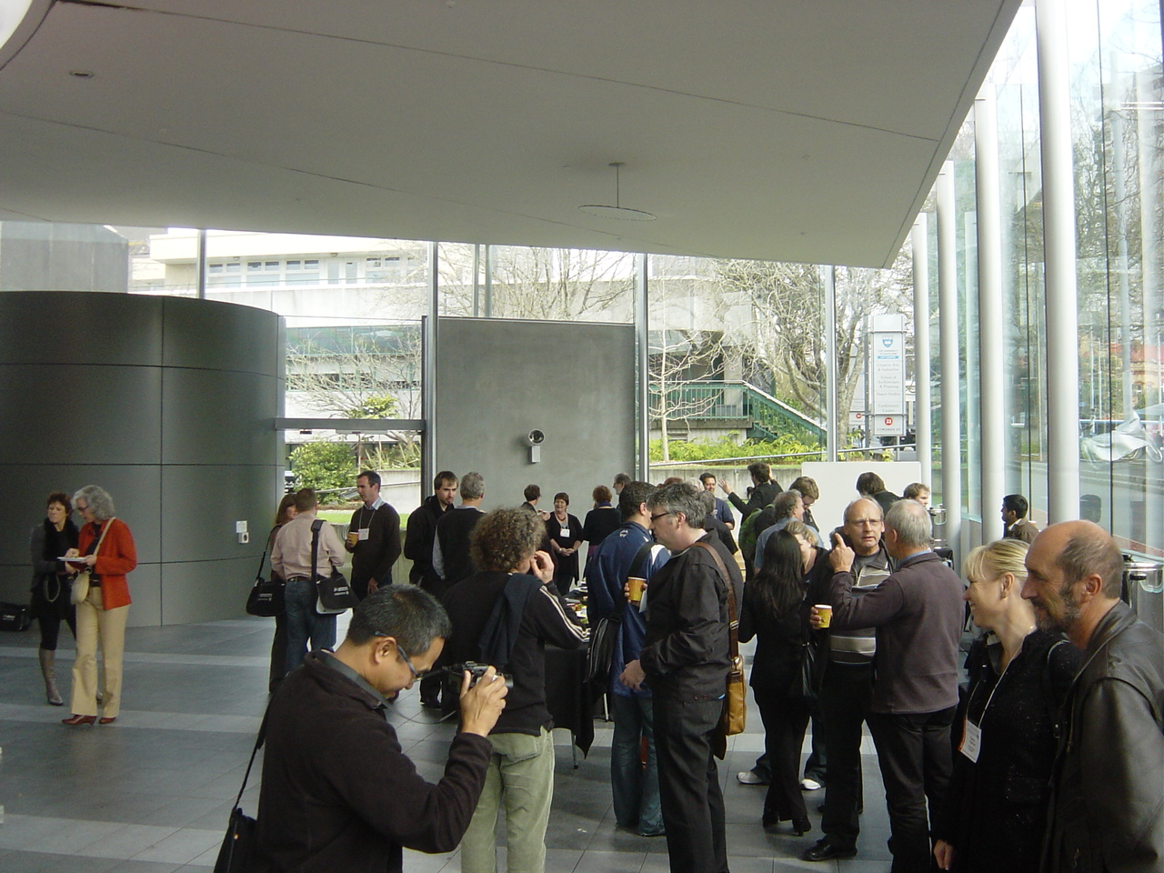
Most valuable part of GeoCart (and any other conference) is seeing old friends and meeting new people interested in cartography. Being relatively small conference (my guess is about 80 attendees) it is easy to talk to anyone. As a result, presentation were sometimes 5 minutes or more delayed.


There were only two vendors present - us (Eagle Technology Group) and GeographX. Igor Drecki did a great job organizing this conference but he run out of time to get more vendors. Both stands had a reasonable attendance as visible from photos below.


Map exhibition was relatively small but maps very interesting. Probably the NIWA's map got most attention but Health Atlas of England and Wales, Geomorphology and other got their share of attention.


This GeoCart, like several previous was put together by Igor Drecki and his team. Thank you for hard work and see you again at next GeoCart.

Before the conference on 30-31 August I have attended Map Design with ArcGIS workshop led by Dr Cynthia Brewer. It was very well attended (actually quite big one - 45 attendants) and over two days various aspects were covered. Being a very large workshop Igor asked me if I could assist and help out students when needed. Of course, I was more than happy to help. Technically, there wasn't any unknowns for me but Cynthia's and Chris's experiences and advices were very helpful. Most interesting parts were relief shading exercises and generalization. For sure I'll be going back to notes and "playing" more with generalization.
On Wednesday, GeoCart started. I have no intention to write about each keynote or paper presentation. For full details of programme check this link. As usual (for last 3 GeoCart conferences that I can speak for) keynote presenters and presented topics were very well picked. If you have William Cartwright, Cynthia Brewer, Manfred Buchroithner, Phil Allen, Colin MacDonald and David Crossman as keynote speakers it can't fail.
Paper presentations were divided in two streams: applied cartography and academic papers. This was a nice balance and change from previous conference. I prefer to see more applications and products then just cartographic theory and research. In some cases paper presentation quality was below par. I would like to see more skilled presenters delivering these papers. Unfortunately, this is up to author(s) to decide - present it yourself of let the more skilled presenter/colleague to deliver it.
Most valuable part of GeoCart (and any other conference) is seeing old friends and meeting new people interested in cartography. Being relatively small conference (my guess is about 80 attendees) it is easy to talk to anyone. As a result, presentation were sometimes 5 minutes or more delayed.


There were only two vendors present - us (Eagle Technology Group) and GeographX. Igor Drecki did a great job organizing this conference but he run out of time to get more vendors. Both stands had a reasonable attendance as visible from photos below.


This GeoCart, like several previous was put together by Igor Drecki and his team. Thank you for hard work and see you again at next GeoCart.

Friday, August 20, 2010
GeoCart 2010 is only 11 days away
It is almost time to meet cartographers from New Zealand and rest of the world again at GeoCart. This is fifth conference (I have missed the first two) and the theme of this one is:
Cartographies of Tomorrow: Mapping in a mashed-up world
As before there are keynote speakers from all over the world including:
At last GeoCart in 2008 I had a privilege to listen William Cartwright, David DiBiase and others. I am really looking forward to hear Cynthia's keynote and even more to be in the "Map Design with ArcGIS workshop" . Workshop will be held before GeoCart, from 30-31 of this month. This will be a nice opportunity to focus on cartography rather then on geodatabase or other technical aspects of GIS.
I'll post more on GeoCart and the workshop when it starts. See you there.

Cartographies of Tomorrow: Mapping in a mashed-up world
As before there are keynote speakers from all over the world including:
- Cynthia Brewer, Pennsylvania State University, USA
- Manfred Buchroithner, TU Dresden, Germany
- William Cartwright, RMIT University, Australia, President of the ICA
- Phil Allen, GeoSmart, New Zealand
- David Crossman, Royal New Zealand Navy, New Zealand
- Colin MacDonald, LINZ, New Zealand
At last GeoCart in 2008 I had a privilege to listen William Cartwright, David DiBiase and others. I am really looking forward to hear Cynthia's keynote and even more to be in the "Map Design with ArcGIS workshop" . Workshop will be held before GeoCart, from 30-31 of this month. This will be a nice opportunity to focus on cartography rather then on geodatabase or other technical aspects of GIS.
I'll post more on GeoCart and the workshop when it starts. See you there.
Friday, January 29, 2010
Bump Mapping Toolbox and articles
You may be familiar with Jeffery Nighbert's paper about bump mapping. It was published in 2003 and results produced using this method are always very effective. Original paper showcase this very nicely as shown on picture below. This paper was additional handout material for Cartography with ArcGIS course whenever I taught this course.

After long wait ESRI has finally produced a Toolbox for ArcGIS Desktop that will help you to create maps like one above. Further more there are now three articles about bump mapping on Mapping Centre and they should be a compulsory reading for ArcGIS users with special interest in cartography.

After long wait ESRI has finally produced a Toolbox for ArcGIS Desktop that will help you to create maps like one above. Further more there are now three articles about bump mapping on Mapping Centre and they should be a compulsory reading for ArcGIS users with special interest in cartography.
- Introducing the ArcGIS Bump Map Tools
- Symbolizing the Bump Map
- A concise history of Bump Mapping by Jeffrey Nighbert himself.
Now all you have to do is to download it from here and start producing beautiful maps. Good luck and feel free to send me the samples of your maps and will post them up here.
Thursday, November 26, 2009
GIS Wikipedia is alive
As ESRI user I am used to visit support center in search for software requirements, technical articles or description of workaround and known bugs. Now ESRI has created a new Wiki site http://wiki.gis.com/
Even if it is initiated by ESRI Wiki.GIS is not about ESRI, it is about GIS and us, users being successful in what we do day to day.

There is already reasonable amount of content there including list of all ESRI software, 32 free software packages and Google Earth section with 5 pages.

As described below it is up to us to make this work.
Even if it is initiated by ESRI Wiki.GIS is not about ESRI, it is about GIS and us, users being successful in what we do day to day.
Wiki.GIS.com is a community-generated, GIS-centric encyclopedia that serves as a repository for factual, unbiased GIS content. Wiki.GIS.com will seek to involve the GIS community in an ongoing process of creation and collaboration of conceptual GIS information. Wiki.GIS.com will use the passion and knowledge each one of you has, in order to offer another resource for users to help others. All content ownership will be shared by the GIS community
There is already reasonable amount of content there including list of all ESRI software, 32 free software packages and Google Earth section with 5 pages.

As described below it is up to us to make this work.
The success of wiki.GIS.com depends on the contributions of GIS professionals, students, and the GIS community-at-large. We invite all the people who have a common interest in sharing GIS knowledge and ideas to create a login account on wiki.GIS.com and then begin editing existing pages or adding their own GIS-related content to the wiki. We have a list of requested pages on the wiki for which we are seeking content, but please feel free to add more topics/content as you deem fit. All unbiased GIS-related content is welcome.
Friday, September 25, 2009
New topographic map series for New Zealand
Yesterday LINZ has released a new map series of topographic maps for 1:50,000. It is also known as Topo50. Significance of this release is in fact that it is based on New Zealand Transverse Mercator projection and NZGD2000 – new datum for New Zealand.
Details, samples and other information is available on new web site Topo50 Map.

Main reason for change of map series is summarized in FAQ section:
On Downloads page there is a PDF with fact sheet (only 114 KB) with details of NZTM2000 (New Zealand Transverse Mercator 2000) and how to use new maps with GPS.
If you are outside of New Zealand and you are using NZ maps make sure you get new ones.
Details, samples and other information is available on new web site Topo50 Map.

Main reason for change of map series is summarized in FAQ section:
The change was required as a result of Land Information New Zealand releasing a new national datum New Zealand Geodetic Datum 2000 (NZGD2000) to replace the New Zealand Geodetic Datum 1949 (NZGD1949).As a result of this datum change coordinates on map series have moved by 190m in north/sourh and 10m east/west direction.
The NZGD1949 datum was a ‘local’ datum that was no longer accurate enough and was limited by the survey technology available at the time. The accuracy has also degraded significantly due to the natural process of earth deformation.
The NZGD2000 datum is an ‘international’ datum and for all practical purposes is the same as that use by GPS.
On Downloads page there is a PDF with fact sheet (only 114 KB) with details of NZTM2000 (New Zealand Transverse Mercator 2000) and how to use new maps with GPS.
| Projection | Transverse Mercator |
| Origin Latitude | 0.0 degrees South |
| Origin Longitude | 173.0 degrees East |
| False Northing | 10,000,00 m North |
| False Easting | 1,600,000 m East |
| Central Meridian scale factor | 0.9996 |
If you are outside of New Zealand and you are using NZ maps make sure you get new ones.
Thursday, June 25, 2009
ColorBrewer 2.0 released
Well known ColorBrewer just got a facelift with release of ColorBrewer 2. Just in case you have not used the essence is compacted in a single line.
What I like about ColorBrewer is that evey option, like “pick a color scheme:” has a learn more > link.

Under this link there are descriptions of icons or references to related books or web sites.


The process of selecting data classes, colours is easy and provides quick feedback using a sample map. In addition to this there is a new option to downlad ColorTool for use in ArcGIS directly. If you are not ArcGIS user these colours can be exported to Excel file, Adobe Swatch Exchange or just set of color values (RGB, CMYK or HEX).

This a very useful site and I recommend it to anyone working in GIS or cartographic design.
Color advice for cartographyDriven by this simple idea Cynthia Brewer created this very useful web application. The new version is Flash based but the functionality is the same as in old one.
What I like about ColorBrewer is that evey option, like “pick a color scheme:” has a learn more > link.

Under this link there are descriptions of icons or references to related books or web sites.


The process of selecting data classes, colours is easy and provides quick feedback using a sample map. In addition to this there is a new option to downlad ColorTool for use in ArcGIS directly. If you are not ArcGIS user these colours can be exported to Excel file, Adobe Swatch Exchange or just set of color values (RGB, CMYK or HEX).

This a very useful site and I recommend it to anyone working in GIS or cartographic design.
Layer package patch for ArcGIS 9.3.1
New patch was released yesterday to addresses issues with downloading secure content from ArcGIS Online when using ArcGIS Desktop. If you are not using ArcGIS Online this is not a critical patch but ESRI is recommending download at earliest convenience.
File to download is gis931-DLL-patch.msp and it is only 1 MB.
Monday, June 8, 2009
3D hypsographic shaded print
It is interesting how things coincide…
In end of May I was in Wellington teaching “Cartography with ArcGIS” course and thought “I should write a post about that 3D print I did...” And several days later there is a post about 3D prints on Free Geography Tools blog.
Back to the 3D print I did. The print was done quite a while ago, for a NZ ESRI User Group Conferecne in October-November of 2006. About one month before the Conference I got an e-mail with brochure about 3D printers from Contex. One of the vendors at the conference has these printers but they don’t offer print services. Eagle Technology is the main sponsor of the conference so was in contact with vendors. Luckily, there is another company in Auckland that has 3D printer and it is interested in collaboration. That company is 3D Print. When we met they showed me promotional GIS/mapping model they have. It was a standard size (30x30cm) tile with a city in flat area with satellite image draped on top. It wasn’t impressive since tallest feature on print was about 2cm tall. I have suggested that we put something together – I can provide data/model and they would print it. So we started working on this project.
I have access to topographic data for whole New Zealand including the 20m contours lines. The question was what area to choose. One of immediate candidates was Wellington area for several reasons: conference is held in Wellington and terrain has interesting features. It didn’t take me long to create a DEM and hillshade from available data. Then I started experimenting with the colours. I have experimented a bit with elevation colour ramps (like described in this post). Here are some test combinations applied on top of Swiss hillshading. There are subtle differences visible in highest mountain region in southeast.


Here is one of the first tries I liked the best.

This is looking promising and I though it would be nice if I could get bathymetry data for Cook Straight. Luckily, National institute of Water & Atmospheric Research (NIWA) was very interested and I got the shapefile data for Cook Straight. And it was really exciting to work with the data and see the results. Cook Straight has very interesting features as you can see. From supplied data I created the DEM as displayed below.

Next step is to combine two datasets. The result is shown below.

Now it is back to the colour schemas. NIWA has a colour ramp they are using but I didn’t like it that much.

And here is why. On its own I wouldn’t mind using it but it in my opinion it does not work well with elevation tint.

Here are some test screenshots.


After some testing I have decided to go with blue colour ramps and here are most likely candidates.


With colours almost sorted there was a next challenge – what data format will work the best for 3D print? According to printer’s manual it will work with VRML, 3DS and DXF/DWG data. I had a bit of problems with exporting data as VRML (I was using ArcGIS 9.2 pre-release then). Once exported VRML didn’t really give us the result we were expecting. There was lot of trouble reading the file and getting the texture (picture correctly positioned on top of model). In next try, I made a 3DS file and send it to 3D Print. Few days later I have also sent a DXF file and the image file of the final colour separately so they could experiment and choose the best option.
Eventually, the figured out the best data format and the way to print this (I am not too sure what format was used in the end) and they made first test 3D print from supplied data and this was the result.


Looking at this we have agreed that this is nowhere near to what we have expected. To make it better 3D Print made it bigger, to cover 4 tiles and to have a base and side walls. Each tile is 30x30cm and height depends on the features of terrain. The result was much better. The model was in our Auckland office and then taken to Wellington by one of our staff members about two weeks before the conference. Unfortunately, two of four tiles got broken in transport because the box with print was checked in at the airport. And that was under two week before the Conference!
Then the good guys at 3D Print decided to do more tweaking and make another run/copy of the model. The main reason for tweaking were the colours. All colours came out lighter then everybody has expected or liked. To my surprise, new model looked so much better than the first one.
Here are the photos of the second model taken with my Sony DSC P7 camera (old and not very good).


As you can see even new printed tiles broke but this is not visible when put together.
For the print we have included logos of all parties involved. Can you spot the spike under letter A in EAGLE?

There are some nice features of the terrain visible even if I use just two tiles.

Here are some close up shots to illustrate terrain and undersea features.


On the photo above you can see ‘terraces’ result of undersea configuration – large areas with very small slope. The same effect is noted on Free Geography Tools blog.
For this print we decided not to use solid base in order to save time and material for printing. Here is an underside of one tile.

Lessons learned
This was an interesting experience for several reasons. Firstly, working with new printing technology. Using 3D prints can really bring out the characteristics of the terrain (in this case). These are especially attractive for students and for people who can’t easily create mental picture of an area looking at the topographic map. 3D print as a company was very keen to work with us and demonstrate use of this technology in GIS and mapping.
Choosing symbology was quite difficult considering I had to combine bathymetry and terrain in single product. This would not be that difficult if it was a medium with known characteristics, like paper. In the first try colours used looked fine on screen and test print on paper but when used in 3D print they came out pale. To highlight the coastline I used orange colour that was too strong any line symbol was too wide. Lakes and swamp outlines were also too strong and too wide.
Printing in 3D is not cheap. One tile 30x30cm costs around $300 NZ. All together this printing costs were around $3,000 NZ. Once printed you should take care of the prints since there are quite fragile.
If I get the opportunity to do this again I would be delighted and hopefully the process would be less troublesome.
In end of May I was in Wellington teaching “Cartography with ArcGIS” course and thought “I should write a post about that 3D print I did...” And several days later there is a post about 3D prints on Free Geography Tools blog.
Back to the 3D print I did. The print was done quite a while ago, for a NZ ESRI User Group Conferecne in October-November of 2006. About one month before the Conference I got an e-mail with brochure about 3D printers from Contex. One of the vendors at the conference has these printers but they don’t offer print services. Eagle Technology is the main sponsor of the conference so was in contact with vendors. Luckily, there is another company in Auckland that has 3D printer and it is interested in collaboration. That company is 3D Print. When we met they showed me promotional GIS/mapping model they have. It was a standard size (30x30cm) tile with a city in flat area with satellite image draped on top. It wasn’t impressive since tallest feature on print was about 2cm tall. I have suggested that we put something together – I can provide data/model and they would print it. So we started working on this project.
I have access to topographic data for whole New Zealand including the 20m contours lines. The question was what area to choose. One of immediate candidates was Wellington area for several reasons: conference is held in Wellington and terrain has interesting features. It didn’t take me long to create a DEM and hillshade from available data. Then I started experimenting with the colours. I have experimented a bit with elevation colour ramps (like described in this post). Here are some test combinations applied on top of Swiss hillshading. There are subtle differences visible in highest mountain region in southeast.


Here is one of the first tries I liked the best.

This is looking promising and I though it would be nice if I could get bathymetry data for Cook Straight. Luckily, National institute of Water & Atmospheric Research (NIWA) was very interested and I got the shapefile data for Cook Straight. And it was really exciting to work with the data and see the results. Cook Straight has very interesting features as you can see. From supplied data I created the DEM as displayed below.

Next step is to combine two datasets. The result is shown below.

Now it is back to the colour schemas. NIWA has a colour ramp they are using but I didn’t like it that much.
And here is why. On its own I wouldn’t mind using it but it in my opinion it does not work well with elevation tint.

Here are some test screenshots.


After some testing I have decided to go with blue colour ramps and here are most likely candidates.


With colours almost sorted there was a next challenge – what data format will work the best for 3D print? According to printer’s manual it will work with VRML, 3DS and DXF/DWG data. I had a bit of problems with exporting data as VRML (I was using ArcGIS 9.2 pre-release then). Once exported VRML didn’t really give us the result we were expecting. There was lot of trouble reading the file and getting the texture (picture correctly positioned on top of model). In next try, I made a 3DS file and send it to 3D Print. Few days later I have also sent a DXF file and the image file of the final colour separately so they could experiment and choose the best option.
Eventually, the figured out the best data format and the way to print this (I am not too sure what format was used in the end) and they made first test 3D print from supplied data and this was the result.


Looking at this we have agreed that this is nowhere near to what we have expected. To make it better 3D Print made it bigger, to cover 4 tiles and to have a base and side walls. Each tile is 30x30cm and height depends on the features of terrain. The result was much better. The model was in our Auckland office and then taken to Wellington by one of our staff members about two weeks before the conference. Unfortunately, two of four tiles got broken in transport because the box with print was checked in at the airport. And that was under two week before the Conference!
Then the good guys at 3D Print decided to do more tweaking and make another run/copy of the model. The main reason for tweaking were the colours. All colours came out lighter then everybody has expected or liked. To my surprise, new model looked so much better than the first one.
Here are the photos of the second model taken with my Sony DSC P7 camera (old and not very good).


As you can see even new printed tiles broke but this is not visible when put together.
For the print we have included logos of all parties involved. Can you spot the spike under letter A in EAGLE?

There are some nice features of the terrain visible even if I use just two tiles.

Here are some close up shots to illustrate terrain and undersea features.


On the photo above you can see ‘terraces’ result of undersea configuration – large areas with very small slope. The same effect is noted on Free Geography Tools blog.
For this print we decided not to use solid base in order to save time and material for printing. Here is an underside of one tile.

Lessons learned
This was an interesting experience for several reasons. Firstly, working with new printing technology. Using 3D prints can really bring out the characteristics of the terrain (in this case). These are especially attractive for students and for people who can’t easily create mental picture of an area looking at the topographic map. 3D print as a company was very keen to work with us and demonstrate use of this technology in GIS and mapping.
Choosing symbology was quite difficult considering I had to combine bathymetry and terrain in single product. This would not be that difficult if it was a medium with known characteristics, like paper. In the first try colours used looked fine on screen and test print on paper but when used in 3D print they came out pale. To highlight the coastline I used orange colour that was too strong any line symbol was too wide. Lakes and swamp outlines were also too strong and too wide.
Printing in 3D is not cheap. One tile 30x30cm costs around $300 NZ. All together this printing costs were around $3,000 NZ. Once printed you should take care of the prints since there are quite fragile.
If I get the opportunity to do this again I would be delighted and hopefully the process would be less troublesome.
Friday, March 27, 2009
ESRI DevSummit 2009 videos
Developer Summit is almost finished. There is plenty of news from the summit on blogs like Mandown, Rise and Shout and many others.
If you would like to watch the videos of presentations then it is your lucky day. DevSummit site has posted videos for the following presentations:
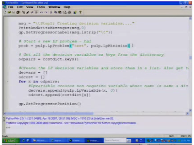
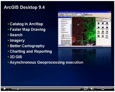
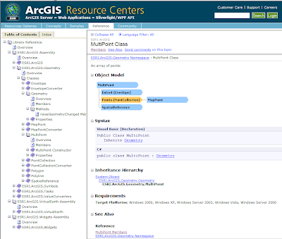
Here are just a few screenshots of Resources & Silverlight, Python and Desktop 9.4 videos.

This is not the only place that is updated. Resource center is also updated with Silverlight/WPF API samples and documentation.


If you would like to watch the videos of presentations then it is your lucky day. DevSummit site has posted videos for the following presentations:
- Welcome and platform
- Fast maps and Java
- Explorer and Online
- Resource centers and Silverlight
- ArcGIS Online
- Python
- Desktop 9.4
- Server and Mobile 9.4
Here are just a few screenshots of Resources & Silverlight, Python and Desktop 9.4 videos.


This is not the only place that is updated. Resource center is also updated with Silverlight/WPF API samples and documentation.


If this is not enough or you want to see how to work with ArcGIS have a look at ArcScripts. There are samples in Java and C# for building tasks in AGS, best practices, security, etc.

Of course ArcGIS Explorer blog is updated with lots of information and screenshots of upcoming release 900. This should be released with ArcGIS 9.3.1. It is shaping up to be a quite important part of ArcGIS system.
Subscribe to:
Posts (Atom)