Elevation #1

Elevation #2

Selection or creation of color ramps is determined by a couple of factors. Personal preference and the need to match a particular style. For example, some prefer to use bold or vivid colors whilst others select colors that are subtle. But many times the selection of a color ramp is based solely on the need to replicate an exisiting map.

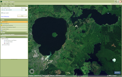
Rotorua is rich in vegetation, mainly forest and bush. It features many lakes but this may be a topic for another post. The elevation in the screenshot is somewhere in the range of 260 to 920 meters above sea level.
The DEM is generated from 20 meter contour lines. The elevation range is between 260 and 920 meters above sea level. Subconsciously map readers associate colours they see on the map with certain phenomena in the real world. For example, showing high mountain peaks with white means they are covered with snow and valleys shaded with green may indicate a forest or grasslands. Based on this phenomena the technique of hypsometric shading uses colors that are derived from nature.
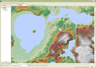
Let’s experiment with the map of Rotorua using different shading styles and settings. Here are defaults.

In many cases this would be adequate, but note the unrealistic “snow covered peaks” in the lower right and centre right corners of the map.

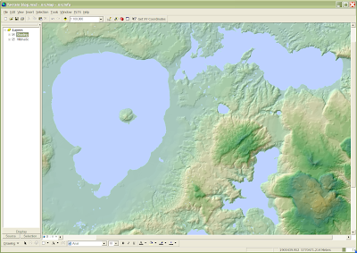
Let’s repeat this with second colour ramp – Elevation #2. Here we can see a lot more or orange/kaki/brown tones giving the impression that some areas are rocky and/or dry. In reality these areas are not.
Elevation 2: Default (260 - 920 m)

Are you are “dazed and confused”? Good, that was my intention. I wanted to demonstrate the possibilities and difficulties associated with hypsometric shading of terrain.
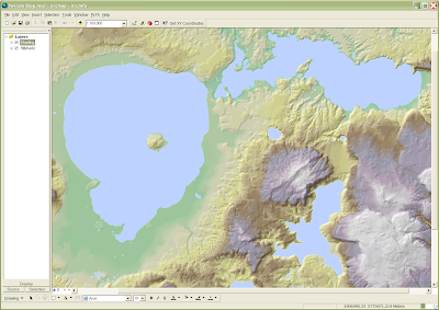
But wait, there’s more! Did you know that ArcMap has a large collection of styles, each style may contains numerous color ramps? Below I have experimented using some of these preset color ramps.
Lastly, if you are frustrated with the out-of-the-box color ramps then there still hope! You have the option of creating your own color ramp that best suits your needs. I will discuss creating custom color ramps another day!


No comments:
Post a Comment